Haven: Secret of Caledria
Real Life vs. Game Dev: An Overhaul Story
Well, it's been years since my last update, and I should probably give you an explanation.
Between closing on a house that needed maintenance, family responsibilities that needed my full attention, and my job needing a lot of my spare hours, this project took a backseat to real life. But during the rare blocks of time that I could dedicate to game dev, I found myself feeling like things needed to be changed or fixed. The lens through which I viewed my project had changed so drastically after trying to pick it back up. Part of me blames the design/project management philosophies that I picked up from working in software development. It really made me look at my project in a negative light because it was such a disorganized mess of spaghetti code and eventing. It was so bad that I dreaded the thought of working on my own game every time I opened RPG Maker. I also hate the idea of using so many plugins from other third party developers now that I'm capable of making my own plugins. You typically don't want to use things that have questionable stability and no support from its developers.
So rather than push on, and risk compromising the quality of the game, I decided to rebuild it (yet again). This time though, the rebuild starts with me having a LOT more tools at my disposal. While I was on hiatus, I watched RPG Maker MZ and third party software grow at an amazing pace. New features were being added that I desperately wanted, and plugins were being made with features that I never thought I'd ever get. Using these as a foundation to facilitate the development of systems I've always wanted to implement was too enticing. With that said, I feel confident that I can make a solid game that's much better than the previous version.
This brings me to the changes. I'd like to highlight a few notable changes with some before and after pictures, while also speaking briefly on some of the technical aspects of the changes.
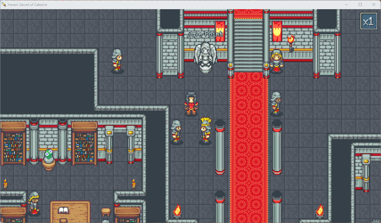
- An overhauled battle system that allows for simplified unit movement. Movement allows me to add a bit of strategic depth. And the goal is to do this in a way that doesn't add friction to the pace of the battles. For example, rather than spending several turns moving into position to execute an attack, you instead automatically move into position based on the attack that's chosen. The goal here is create a risk/reward scenario where choosing specific attacks may yield benefits and/or penalties that should be considered when making the decision. The battle system is built on Visustella's Grid Battle and OTB plugins, but has been heavily modified to add features that you won't find by default.
- Graphics now have a more vibrant color pallette. Contrast has been adjusted to make colors appear less washed out than the previous version of the game. To me, it looks much better. Graphics have also been adjusted to achieve a better level of "pixel perfection". Meaning, the pixel sizes of the graphics are much more consistent between the graphical assets that are used. This is one of those details that'll go largely unnoticed. But anyone who's dealt with pixel art understands that this can earn you a great deal of respect amongst your peers. It's one of those "attention to detail" things that reassure players that you care about making a polished product.
- The UI has been optimized to utilize space more efficiently.
- Tilesets have also been changed. Some have been modified slightly, while there are other tiles that I've made from scratch. The level of customization is at a point where I feel I can separate my game from other games that use the wonderful Time Fantasy assets. I'll share some before & after screenshots to help demonstrate.
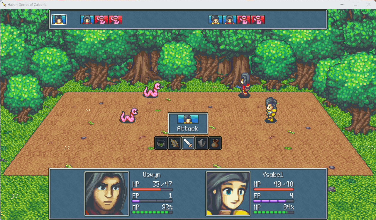
Battle (Old):
Battle (New):
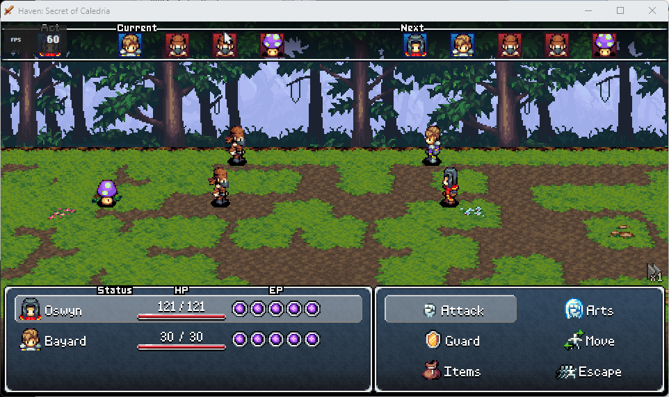
First, I'd like to point out the obvious difference in the color palette. In the old screenshot, colors are washed out in a GBA aesthetic, which isn't really a "bad" thing. But I do like the added color and contrast.
Second, the pixel size. You can see that my sprites are 3x, my ui is 2x, and my skewed battle background is 1x. I absolutely hated this, and it bothered me since day one. The reason why I found it tough to do in earlier versions of RPG Maker is because there wasn't a solid way to change the tile size, which meant keeping most of my resources at 3x (48x48 tiles). The UI, however, couldn't really fit 3x assets into its fixed sixes for things like icons and ui windows. So you were kinda stuck using various pixels sizes. Now, thanks to a RPG Maker MZ update, we can easily swap tileset sizes, and the editor will actually change to accomodate the use of the different tile sizes!
Third, the UI. With the change in pixel sizes, I had to also change the game's resolution. I decided to go with 960x540, since it scales evenly into a lot of the more common screen resolutions. You'll also notice that there's a lot less empty space in the UI. I've customized the placement of both the Battle Log, the Help Window, and the Battle Command window to keep everything in one area for a better user experience. Some of you might say you like the old UI better, but this change was more about optimizing the user experience and using space effectively.
Main Menu (Old):
Main Menu (New):
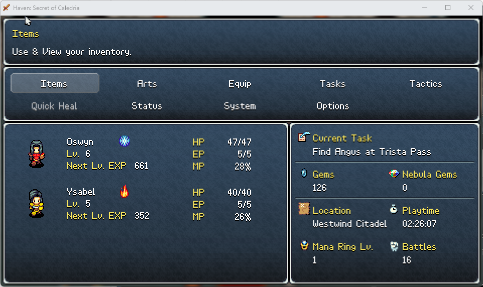
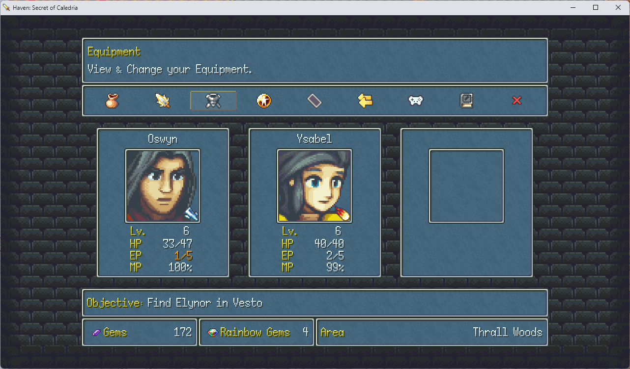
The Main Menu, and other menus, have gotten a bit of an overhaul. Nothing fancy. Just simple and effective. I drew inspiration from the Tales of Series with this particular design. More specifically, the window on the right. We have all our at-a-glance information in a single window that reads from top to bottom, starting with the most important information. You'll also notice a sweeping change; the Faces. Yes, they're gone. I wasn't too fond of the art style of them. I "might" bring them back to the status menu, but we'll see. For now, I like the idea of showing animated sprites in the menu. Spices it up a little bit.
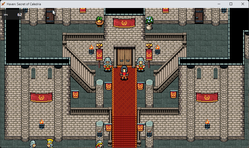
Westwind Citadel (Old):
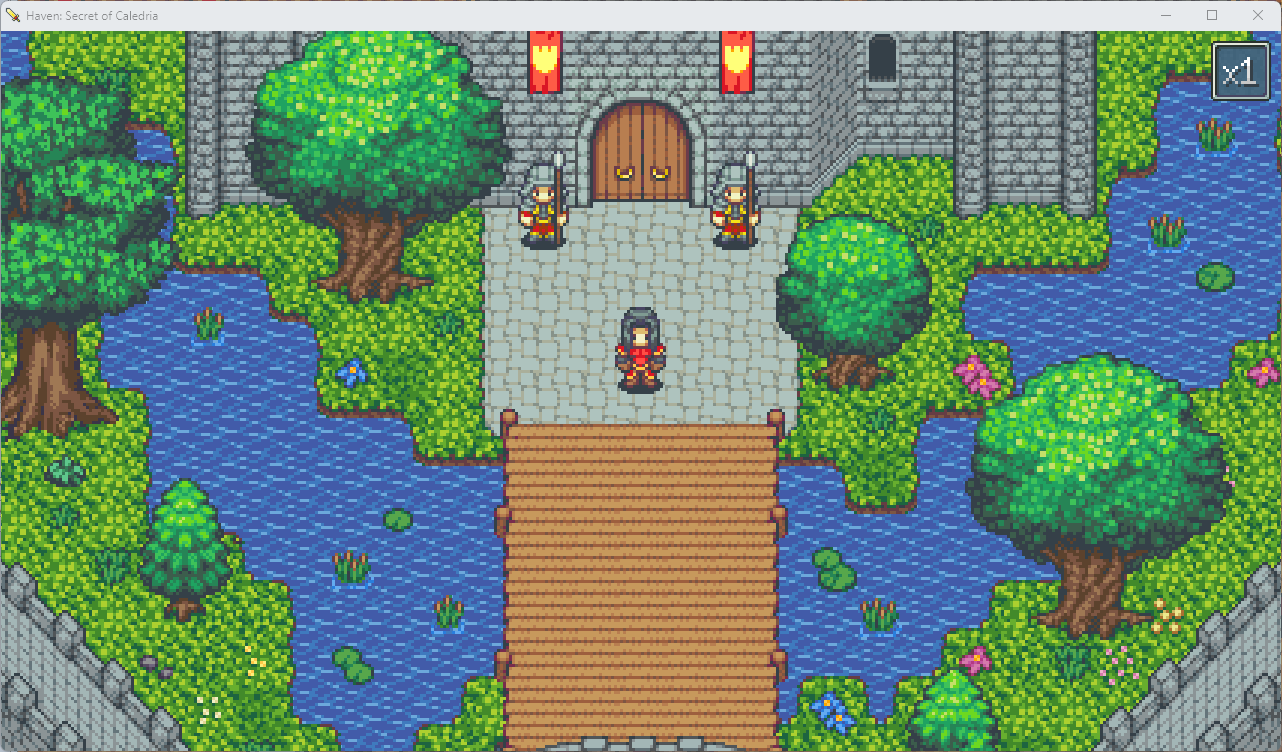
Westwind Citadel (New):
I don't think I really need to explain this. But one thing I want to point out is the flexibility of the way these tiles are built. It makes for a much easier mapping process. Also love the grass and tree textures.
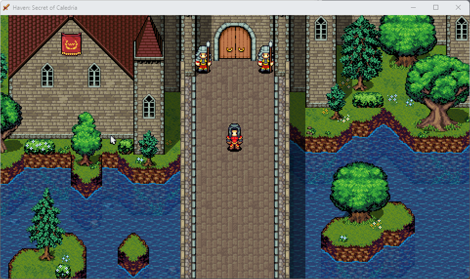
Westwind Hall (Old):
Westwind Hall (New):
Again, not much to explain here. Things just look better, in my opinion. Part of that is due to the actual change in the map, but I just love these tiles I put together. This was made using a resource pack called Open RTP, which is a remake of the old RM2K tiles. I added a few custom tiles myself along with some existing Time Elements tiles. Really happy with the outcome.
Lastly...
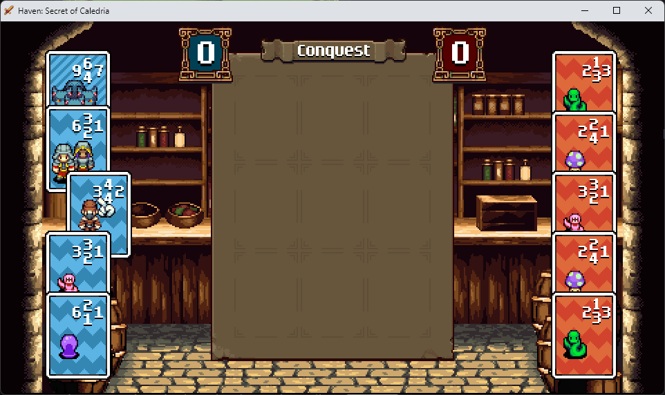
My little Triple Triad clone is back and better than ever. I've decided to call the game "Conquest". In previous versions of the demo, I used the same plugin that pretty much everyone in the RPG Maker community uses. The problem with that plugin is that it wasn't really user-friendly. It had several bugs that prevented things like using the mouse and keyboard interchangeably, a rather basic AI implementation, and a UI/UX that was, in my opinion, very janky. I'm happy to say that I've built this particular feature from scratch using a backend/frontend approach. Without getting into the complexities of the code, I've basically made it so that there are a bunch of functions that just move pictures around on the map. Doing it this way allows me to leverage other plugins that can give me some neat, flashy card animations. The demo will only have the basic rules for now, but the plan is to add "Same" and "Plus" rulesets. Combo MIGHT be implemented. I've laid the groundwork for it. But I actually REALLY hate that ruleset, and I don't think I'm the minority when it comes to that thought. So we'll see.
That's about all I'd like to show at this point. I'll save the rest for those who want to play the demo. Which I'm hoping will be publicly released in a couple of weeks. I have a Beta demo that I need to run by some fellow RPG Maker Devs to make sure it's actually suitable for the public. After that, I'm going to hit the ground running. This summer is shaping up to give me a LOT of free time, and I hope to dedicate most of that free time to development.
Thanks for all your support! Stay tuned!
WARNING!
For some silly reason, itch.io doesn't allow me to remove the game's download link from blog posts. The download you see below is NOT the current version at the time of this blog post being published. So please understand that you will be downloading a very old version.
Comments
Log in with itch.io to leave a comment.
so you’re now using the Time Elements tiles?
For the most part, yes. There are some tiles merged and modified from Time Fantasy as a base. And also from Open RTP.
The changes all look very good! I'm a bit partial to the "GBA" aesthetic mostly for nostalgia reasons, but it's undeniable that those news tiles look better, and the UI is especially improved. Looking forward to getting to play this version!
Can't wait to see the new changes.
Made my week so far🫶
it's time boys
Nice improvements! Now the trick is to keep up the momentum. good luck man!